

This page traces every crest Inter Milan has worn, from the 1908 monogram by a painter to the two-letter mark, with each era’s colors as one-click hex values.
Inter exists because of a split over foreign players in 1908, and the name Internazionale is the argument itself.
The founding monogram survived fascism and every postwar redesign, until the 2021 rebrand cut it down to I and M.
Today it runs on blue, black and white: #00239C #000000 #FFFFFF. For RGB, CMYK and Pantone, see the current Inter Milan color codes.
Inter Milan logo history timeline
Inter Milan logo 1908-1928
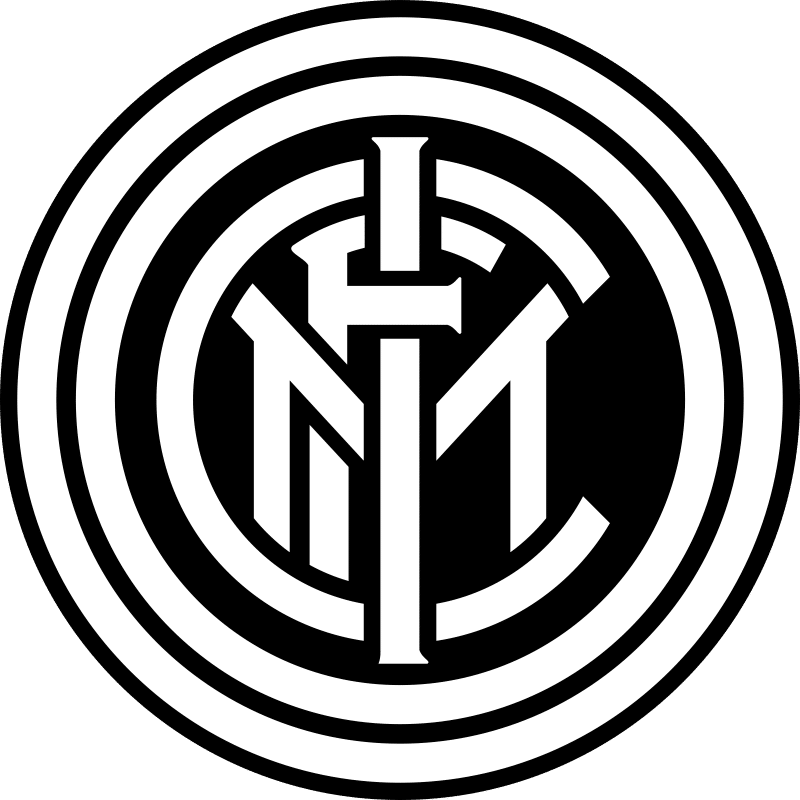
Original Art Nouveau-style circular monogram designed by founding member Giorgio Muggiani, with interlaced letters forming an 'FCIM' monogram on a gold background, surrounded by two concentric black and blue rings. The club's black and blue colors were described by Muggiani as representing night sky and stars.
Inter Milan logo 1928-1929
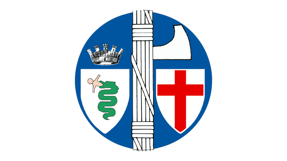
Club forcibly merged with Unione Sportiva Milanese and renamed Ambrosiana under Fascist pressure against the internationalist name 'Internazionale'. Crest replaced the FCIM monogram with a fascist fasces flanked by the Visconti biscione (serpent) and the red-cross shield of Milan.
Why it changed: Fascist-era hostility to the 'internationalist' connotation of the club's name forced a merger and rebrand as Ambrosiana.
Inter Milan logo 1929-1931
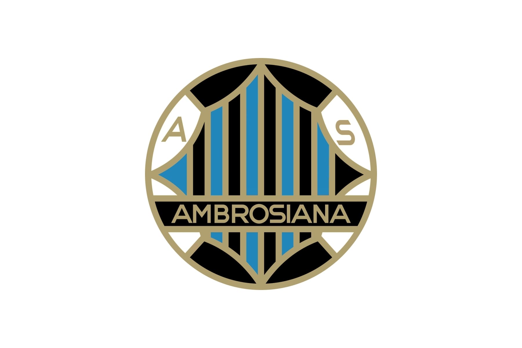
Rounded/oval crest with black-and-blue (nerazzurri) stripes bordered in gold, with 'AMBROSIANA' in gold lettering on a black background at the centre.
Why it changed: Continuation of the Ambrosiana rebrand under Fascist-era naming restrictions.
Inter Milan logo 1931-1945
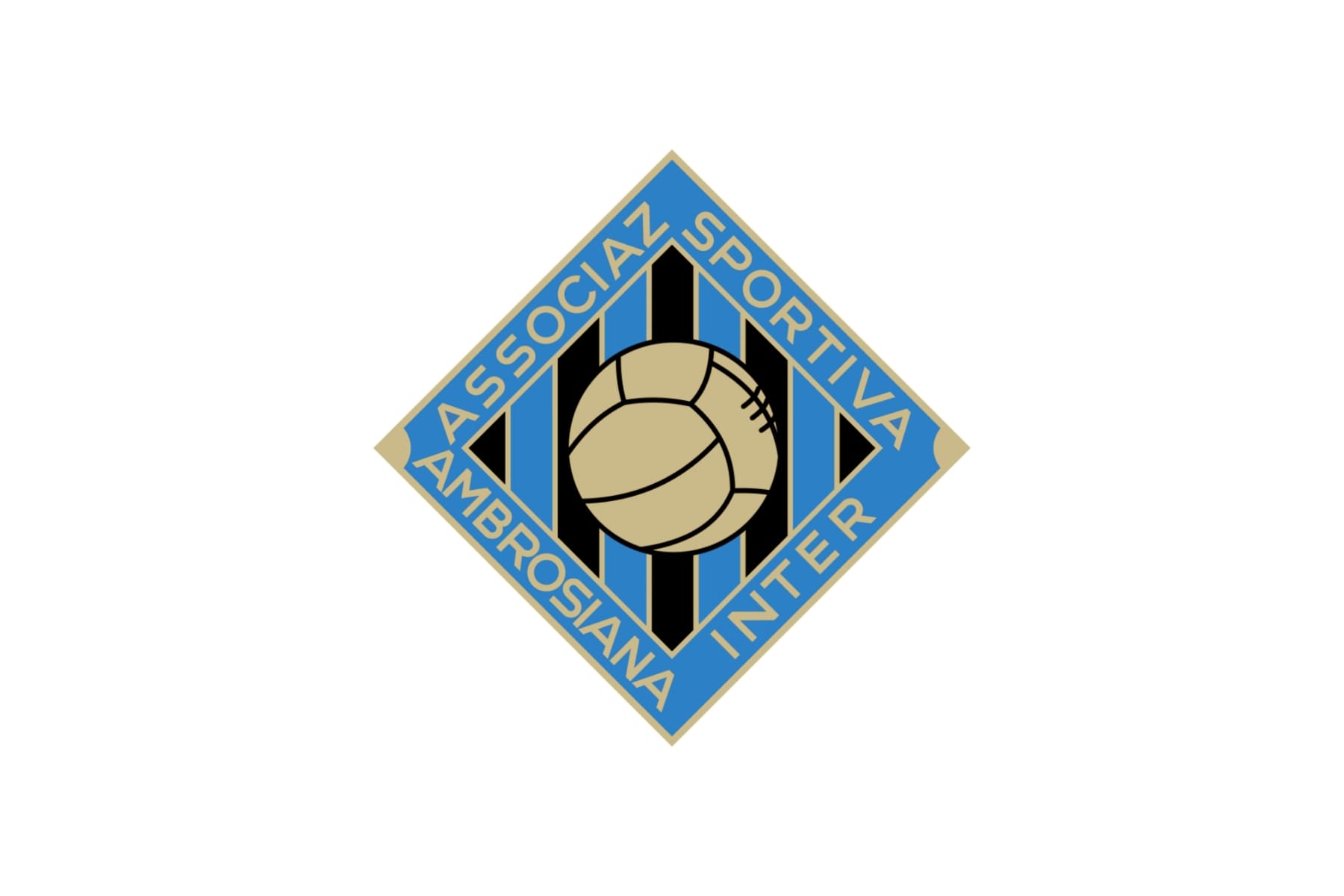
First rhomboid-shaped crest with nerazzurri stripes and a football at centre; text read 'Associazione Sportiva Ambrosiana Inter', partially restoring the 'Inter' name that fans and press had kept using informally.
Why it changed: Gradual softening of the fascist-era naming restriction, allowing partial reinstatement of 'Inter' alongside 'Ambrosiana'.
Inter Milan logo 1945-1960
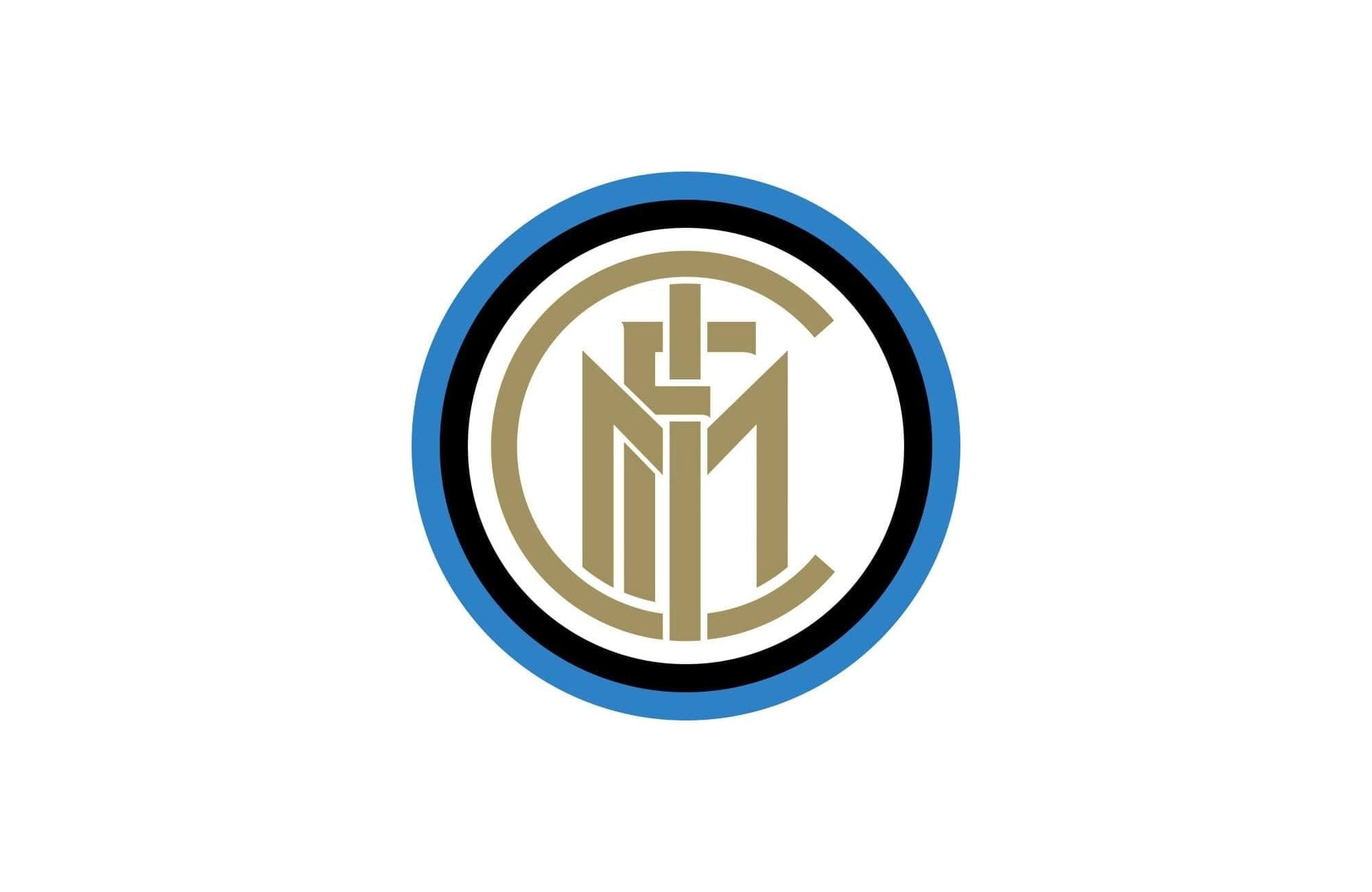
Post-war reversion to the club's founding identity as Internazionale (Ambrosiana name dropped); the historic FCIM monogram returned, rendered in gold on white and first used on jerseys in the 1958/59 season.
Why it changed: End of the Fascist regime's naming restrictions after WWII; the club reclaimed its founding name and identity.
Inter Milan logo 1960-1963
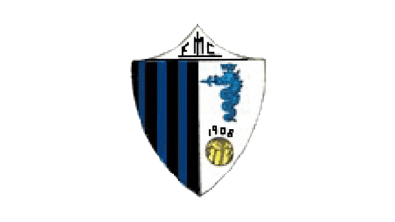
Crest split into two vertical halves: black-and-blue stripes on one side, white on the other featuring the Visconti biscione, a football, and the founding year 1908.
Inter Milan logo 1963-1978
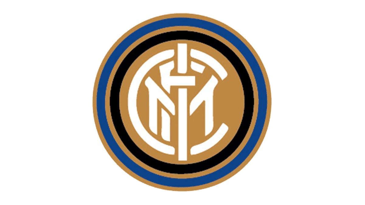
Return of the original Muggiani-style monogram design with restyling and an increased gold presence around the concentric circles.
Inter Milan logo 1978-1988
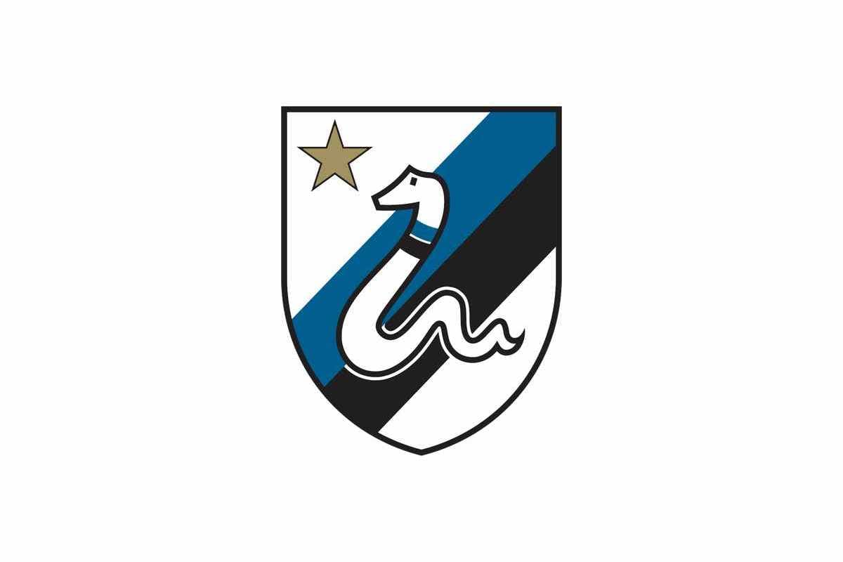
Shield-shaped crest with diagonal black, blue and white stripes and a modernized biscione; a gold star was added above the shield marking the club's 10th Scudetto (league title), first won in 1965/66.
Why it changed: Star added to mark the milestone of 10 league titles.
Inter Milan logo 1989-1999
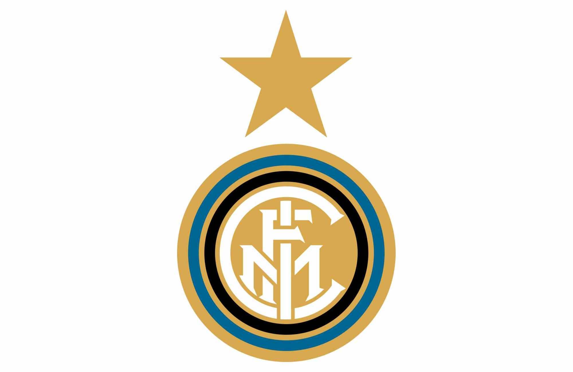
Return to the classic FCIM monogram in white on a dominant gold background with an enlarged star, worn during the club's UEFA Cup-winning era.
Inter Milan logo 1999-2007
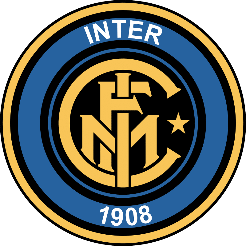
Blue became the dominant background color, with 'INTER' and '1908' in white, a gold FCIM monogram, and the star retained.
Inter Milan logo 2007-2014
2007 restyling rebalanced the concentric circles; a 2007/08 centenary version added a gold ring reading '1908-2008, 100 ANNI INTER', and a 2009/10 treble-year version incorporated a tricolour (Italian flag) ring.
Why it changed: Centenary celebration (100 years since 1908 founding) and later commemoration of the 2010 treble.
Inter Milan logo 2014-2021
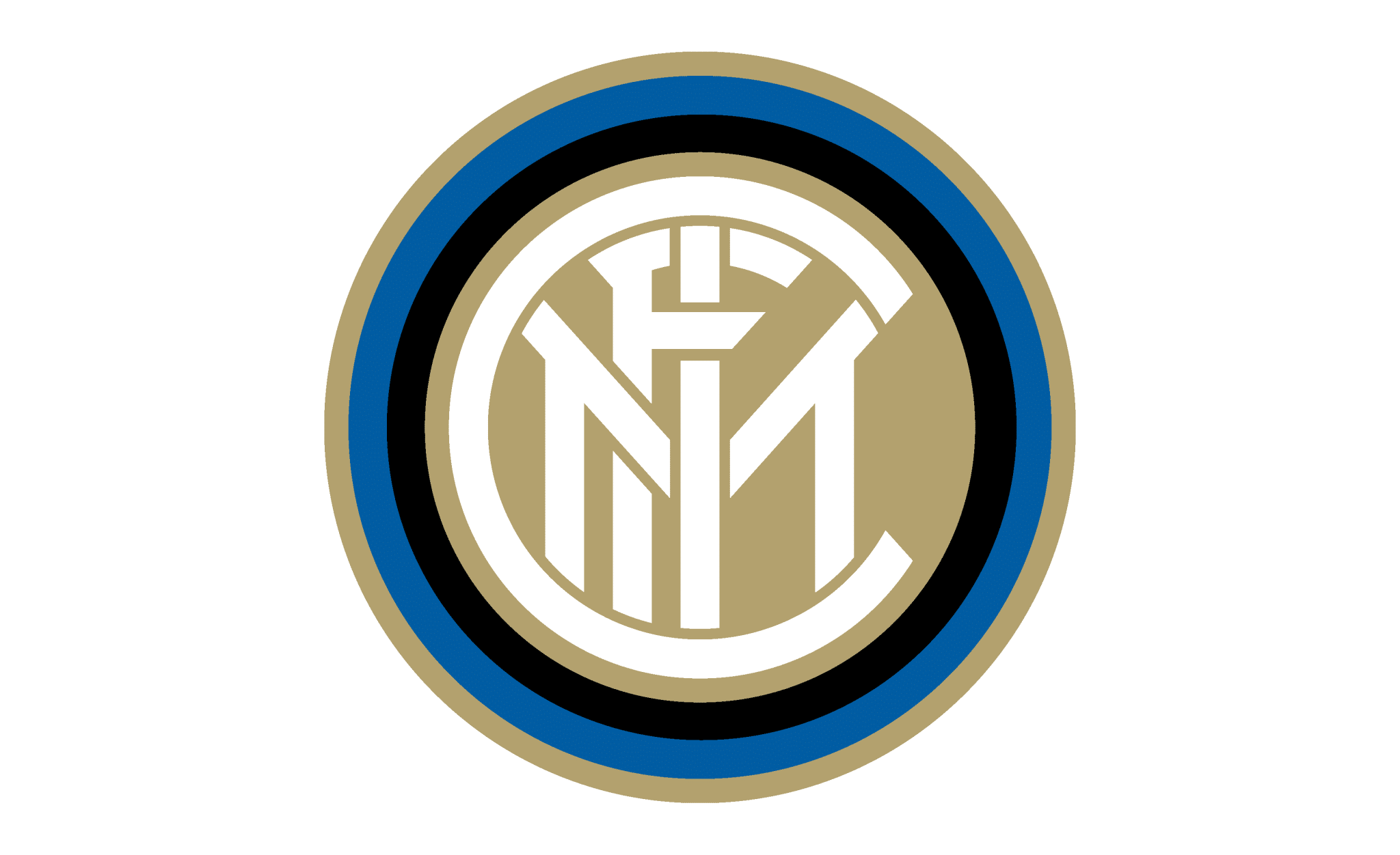
Restyled FCIM monogram with refined line-work for better recognition at small sizes, kept within a triple black/blue/gold ring; the star became reserved for official match kits.
Why it changed: Modernization for legibility and digital/merchandising use.
Inter Milan logo 2021-present

Complete rebrand under the campaign 'I M Inter' (Inter Milano / 'I am'), replacing the circular FCIM/biscione monogram with a minimalist interlocking 'I' and 'M' mark. 'Football Club' wording and all gold coloring were dropped; a new, brighter blue was introduced alongside black and white.
Why it changed: Club-stated aim to modernize the visual identity for a younger, more global and digitally-oriented audience; part of a wider trend of Italian clubs (following Juventus's 2017 'J' rebrand) toward flat, minimalist marks.
Inter Milan logo colors by era
| Era | Colors |
|---|---|
| 1908-1928 | Black #000000Blue #393939* |
| 1928-1929 | Red #E60000White #FFFFFF |
| 1929-1931 | Black #000000Blue #2186BAGold #B7A777 |
| 1931-1945 | Black #000000Blue #2C80C6 |
| 1945-1960 | Gold #A19161White #FFFFFF |
| 1960-1963 | Black #000000Blue #053973White #FFFFFFGold #8A856A |
| 1963-1978 | Black #000000Blue #0B448CGold #BE8744 |
| 1978-1988 | Black #000000Blue #025E8FWhite #FFFFFF |
| 1989-1999 | White #FFFFFFGold #D8A951 |
| 1999-2007 | Blue #27629FWhite #FFFFFFGold #F8C558 |
| 2007-2014 | Gold #AE9963Black #000000Blue #0254A0 |
| 2014-2021 | Black #000000Blue #005DA2Gold #B3A06E |
| 2021-present | Blue #00239CBlack #000000White #FFFFFF |
Things worth knowing
- The 1908 founding crest was designed by founding member and painter Giorgio Muggiani.
- Fascist pressure against the internationalist name 'Internazionale' forced a 1928 merger with Unione Sportiva Milanese into 'Ambrosiana'; the club's crest lost the word 'Inter' entirely for over a decade, only partially restoring it in 1931 and fully reverting to Internazionale after WWII in 1945.
- A gold star was added to the crest after Inter's 10th league title (Scudetto) in 1965/66, following the Italian football convention of one star per 10 titles.
- The 2021 'I M' rebrand removed the historic Biscione serpent and the FCIM monogram and eliminated gold from the identity entirely, drawing significant backlash from fans and ultras groups who compared it to Juventus's controversial 2017 'J' logo change.
Values marked * were measured from the logo artwork of that period. Brand color standards did not exist for most of these eras, so no official hex value was ever published for them. Treat them as an accurate reading of the artwork rather than as an official brand value. Unmarked values are the club’s own published colors.
Sources
- https://en.wikipedia.org/wiki/Inter_Milan
- https://it.wikipedia.org/wiki/Football_Club_Internazionale_Milano
- https://www.inter.it/en/news/2021-03-27-history-inter-crest
- https://www.footyheadlines.com/2021/01/full-inter-milan-logo-history.html
- https://commons.wikimedia.org/wiki/Category:FC_Internazionale_Milano_logos
- https://1000logos.net/internazionale-logo/
- https://www.thickaccent.com/2021/03/30/inter-milan-under-fire-following-new-logo-unveil/
- https://www.dezeen.com/2021/04/06/inter-milan-rebrand-football-logo/
- https://www.cbssports.com/soccer/news/inter-milan-unveil-new-logo-as-part-of-i-m-rebrand


