

This page traces every crest Juventus has worn, from pink shirts in 1897 to the bare J of 2017, with each era’s colors as one-click hex values.
Juventus played in pink until replacement shirts arrived from England in 1903 in the black and white of Notts County.
The 2017 rebrand dropped the bull, the crown and the club’s own name, which makes it the most argued-about crest change in Europe.
Today it runs on black and white: #000000 #FFFFFF. For RGB, CMYK and Pantone, see the current Juventus color codes.
Juventus FC logo history timeline
Juventus FC logo 1897-1904
No logo is shown here because none existed yet. Juventus played its first seven years without a crest, and the club's first emblem dates from 1905.
Juventus was founded in 1897 with early kits in pink and black rather than the now-famous black and white stripes; no single stable heraldic emblem is documented for this period, and sources treat 1905 as the club's first official stemma.
Juventus FC logo 1905-1921
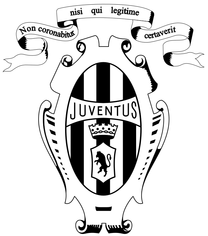
First official stemma: an oval shield with black-and-white vertical stripes containing a rampant/charging bull (the heraldic symbol of the city of Turin), topped by a royal crown and ornamental scrollwork, with a white ribbon bearing the Latin motto 'Non coronabitur nisi legitime certaverit'. Coincides with the 1905 switch from pink-and-black to white-and-black kit colors.
Why it changed: Established the club's first formal heraldic identity alongside the 1905 kit color change.
Juventus FC logo 1921-1929
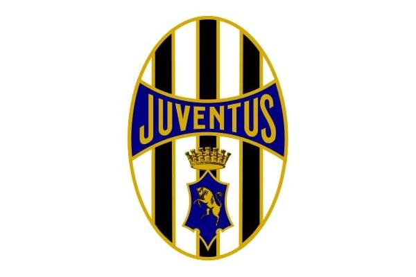
Simplified oval shield retaining the black-and-white striped field and bull, with reduced ornamental scrollwork and a blue accent introduced to the shield contour.
Why it changed: Modernization toward cleaner graphic standards.
Juventus FC logo 1929-1931
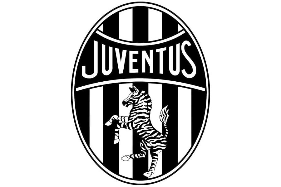
The heraldic bull was temporarily replaced by a stylized zebra as the central figure, matching the club's popular nickname 'le zebre' (the zebras).
Why it changed: Better alignment with the club's zebra nickname rather than the heraldic bull.
Juventus FC logo 1931-1977
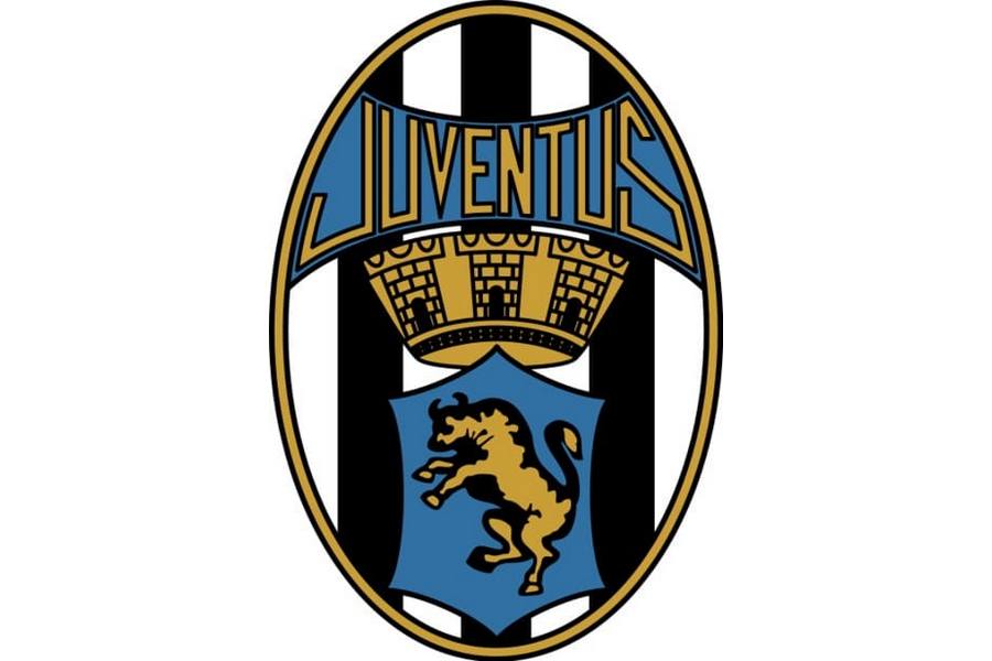
Extended classical period: the bull and crown were restored within the striped oval, with custom lettering; this template served as the club's reference badge for decades and was consciously revived again in 1989.
Why it changed: Return to heraldic tradition after the brief zebra experiment.
Juventus FC logo 1958
No logo is shown here because the crest itself did not change. The gold star was sewn onto the shirt from 1958 and only entered the crest in the 1971 restyling.
Not a full redesign but a documented addition: after winning a 10th Italian league title in 1957-58, Juventus became the first Italian club to add a gold star above its crest/shirt, a practice later formalized across Italian football (one star per 10 titles).
Why it changed: Awarded for reaching a 10th league championship (Scudetto).
Juventus FC logo 1977-1982
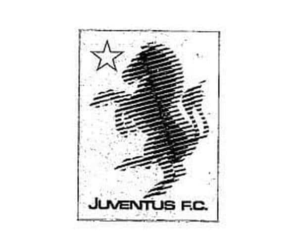
A marked departure from the heraldic oval: a rectangular frame with a star outline and a blurred equine silhouette (described inconsistently across sources as a horse or a stylized zebra), with sans-serif lettering.
Why it changed: Embraced contemporary design trends of the era; the exact equine imagery is disputed across sources.
Juventus FC logo 1982-1989
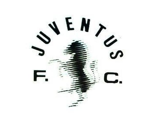
Refinement of the previous version: the rectangular frame and star were dropped, the silhouette simplified, and the arched 'Juventus' wordmark made more prominent.
Why it changed: Refinement toward a cleaner aesthetic.
Juventus FC logo 1989-2004
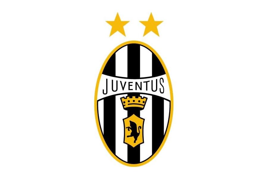
Deliberate heritage revival: return to a version of the 1920s oval badge with the striped shield and bull, enclosed in a thin gold frame, with lighter sans-serif lettering.
Why it changed: Reconnection with historical/heraldic identity.
Juventus FC logo 2004-2017
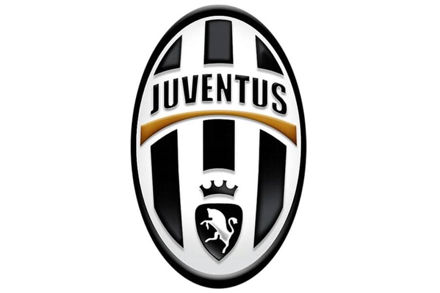
Modernized oval shield with a glossy 3D effect: black-and-white striped oval with a white bull on a black lower section beneath a mural crown (referencing Augusta Taurinorum, Turin's Roman name), a gold-edged 'Juventus' wordmark banner, and two gold stars marking accumulated titles.
Why it changed: Contemporary institutional redesign while preserving the heraldic bull, stripes, crown and stars.
Juventus FC logo 2017-present

Radical rebrand unveiled 16 January 2017 by president Andrea Agnelli with global brand consultancy Interbrand: the heraldic oval, bull, crown and stars were removed entirely, replaced by a flat black-and-white monogram of a stylized 'J' built from two thick vertical bars evoking the club's stripes, used both with and without an accompanying 'Juventus' wordmark.
Why it changed: Explicit brand refresh aimed at global merchandising/lifestyle-brand positioning and a simpler, more versatile mark, framed by the club as evolving from a football club into a football company/brand.
Juventus FC logo colors by era
| Era | Colors |
|---|---|
| 1897-1904 | Black #000000 |
| 1905-1921 | White #FFFFFFBlack #000000 |
| 1921-1929 | White #FFFFFFBlack #000000Blue #060162Gold #CDAD1B |
| 1929-1931 | White #FFFFFFBlack #000000 |
| 1931-1977 | White #FFFFFFBlack #000000Gold #C99C36Blue #3170A3 |
| 1958 | — |
| 1977-1982 | Black #000000White #FFFFFFGray #FFFFFF |
| 1982-1989 | Black #000000White #FFFFFF |
| 1989-2004 | White #FFFFFFBlack #000000Gold #F7BA05* |
| 2004-2017 | White #FFFFFFBlack #000000Gold #A78756* |
| 2017-present | Black #000000White #FFFFFF |
Things worth knowing
- The 2017 Interbrand rebrand is widely cited as one of the most controversial in sports branding history: reaction was largely negative, with many fans and commentators saying the removal of the bull, shield, stripes and crown erased over a century of visual heritage.
- Juventus was the first Italian club to add a gold star above its crest, after winning its 10th league title (Scudetto) in 1957-58; the one-star-per-10-titles convention was later adopted across Italian and other European football.
- The bull on Juventus badges since 1905 is not an original club invention but a reference to the historic coat of arms of the city of Turin, whose heraldic symbol is a charging bull.
- Between 1929 and 1931 the club briefly swapped its heraldic bull for a stylized zebra to match the nickname 'le zebre', before reverting to the bull, showing the badge repeatedly oscillated between heraldic and nickname-driven imagery long before the 2017 rebrand.
Values marked * were measured from the logo artwork of that period. Brand color standards did not exist for most of these eras, so no official hex value was ever published for them. Treat them as an accurate reading of the artwork rather than as an official brand value. Unmarked values are the club’s own published colors.


