

This page traces every logo the New York Yankees have used, from the Baltimore Orioles of 1901 to the interlocking NY, with each era’s colors as one-click hex values.
The franchise began in 1901 as the Baltimore Orioles and became the Yankees only in 1913, which is why orange appears early on.
The interlocking NY is older than the team, because Tiffany drew it in 1877 for a New York police medal of honor.
Today it runs on navy and white: #0C2340 #FFFFFF. For RGB, CMYK and Pantone, see the current New York Yankees color codes.
New York Yankees logo history timeline
New York Yankees logo 1901-1902
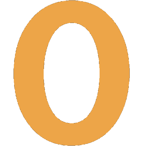
Franchise began as the Baltimore Orioles (AL). 1901: orange block letter 'O' with black interior on cap. 1902: changed to a blue block letter 'B'.
New York Yankees logo 1903-1904
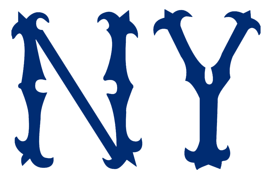
Franchise moved to New York and became the Highlanders; cap featured brown Old English 'NY' letters, sitting separately (not interlocked).
Why it changed: Relocation from Baltimore to New York after the 1902 AL-NL peace agreement
New York Yankees logo 1905-1908
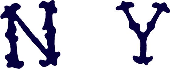
Several successive versions of a separate Old English 'N' and 'Y', changing color (shifted to blue) and letter spacing/font across seasons; sportslogohistory.com lists near-annual tweaks but exact boundary years are inconsistently reported across sources.
Why it changed: Ongoing uniform redesign attempts before settling on the interlocking mark
New York Yankees logo 1909-1912
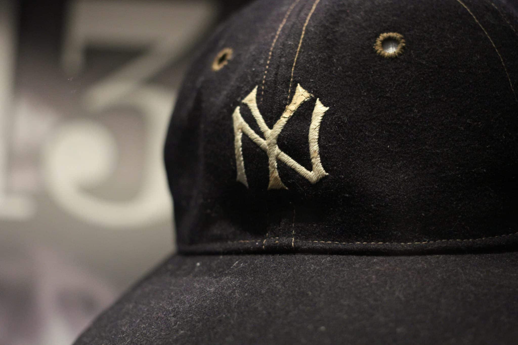
First appearance of the interlocking 'NY' monogram on caps and left sleeve, adapted from a design originally created by Tiffany & Co. for an 1877 NYPD Medal of Valor awarded to Patrolman John McDowell. Owner (and former NYPD Chief) William Devery is credited with borrowing the mark for the club.
Why it changed: Team owner adopted the pre-existing Tiffany-designed NYPD medal monogram as the club's mark
New York Yankees logo 1913-1946
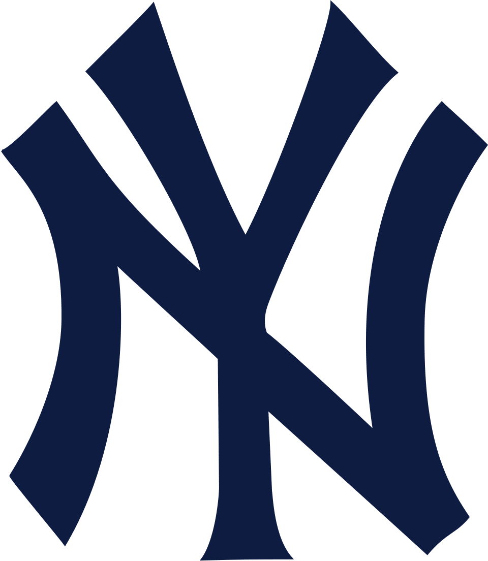
Team renamed New York Yankees in 1913; interlocking NY carried over onto the new franchise name, with reported color varying between brown and dark blue across different sources for this span.
Why it changed: Team name change from Highlanders to Yankees in 1913
New York Yankees logo 1947-1967
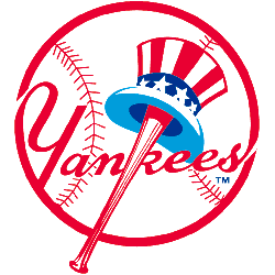
Introduction of the separate 'Yankees' script wordmark/bat logo (designer credited as Henry Alonzo Keller): a red baseball bat forming the 'K', with an Uncle Sam-style top hat hanging off the barrel, used alongside (not replacing) the interlocking NY cap mark.
Why it changed: New supplementary bat-and-hat wordmark logo introduced for team materials
New York Yankees logo 1968-present
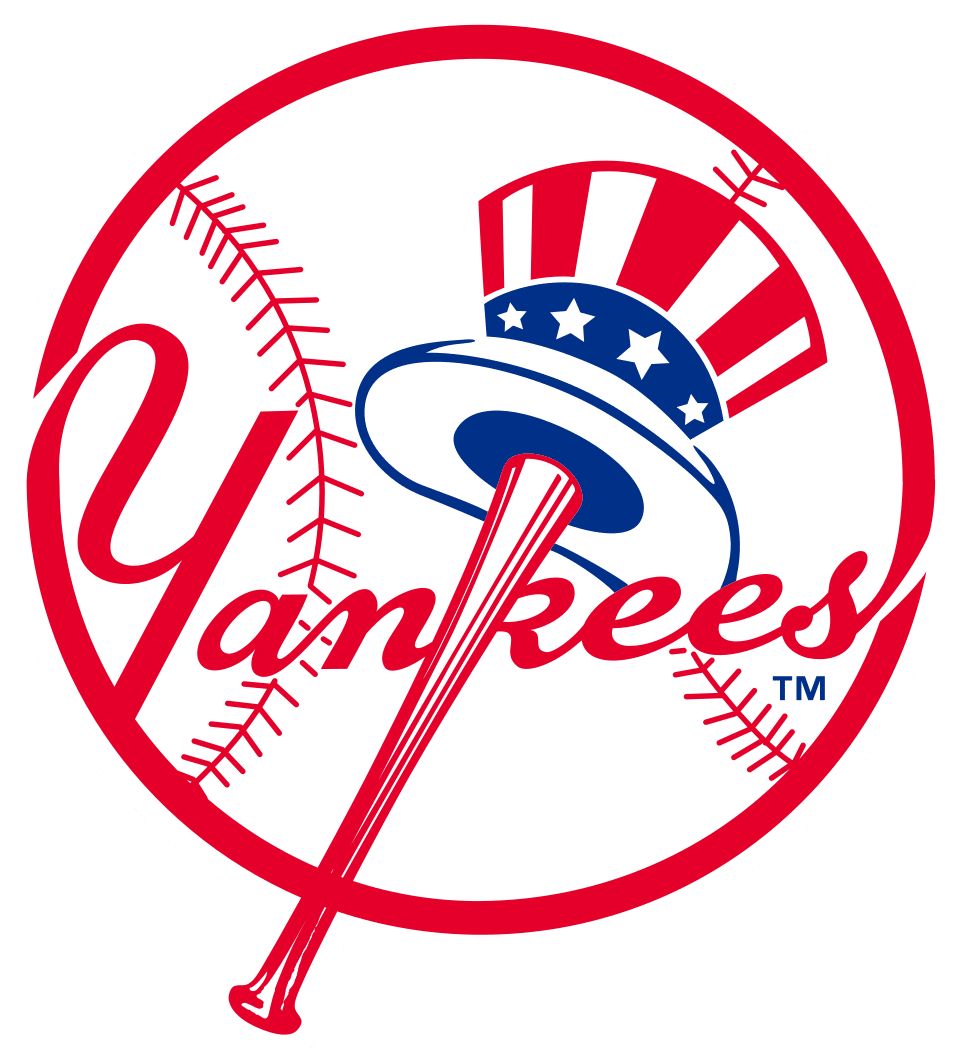
Minor refinement of the bat-and-top-hat wordmark (removal of a powder-blue hat underbrim detail); the interlocking NY cap logo itself has remained visually unchanged since 1909.
Why it changed: Small design cleanup; no major rebrand documented since
New York Yankees logo colors by era
| Era | Colors |
|---|---|
| 1901-1902 | Orange #ECA549*Black #000000Blue #150A6AWhite #FFFFFF |
| 1903-1904 | Brown #002D72* |
| 1905-1908 | Blue #06003E |
| 1909-1912 | Navy/Dark blue #151413* |
| 1913-1946 | Navy #0F1C43Brown #0F1C43* |
| 1947-1967 | Red #E80033Navy #00338E |
| 1968-present | Navy #0C2340White #FFFFFF |
Things worth knowing
- The interlocking NY was designed before the Yankees existed: Tiffany & Co. struck it on a Medal of Valor given to NYPD officer John McDowell in 1877, decades before the ballclub adopted it in 1909.
- The franchise's Baltimore Orioles years (1901-1902) are not counted by the modern Yankees organization as part of official team history.
- The interlocking NY cap logo has gone essentially unchanged for over a century (since 1909), making it one of the most stable logos in North American pro sports.
- The separate bat-and-top-hat 'Yankees' script wordmark (1947, refined 1968) is a distinct logo from the interlocking NY and is often confused with it.
Values marked * were measured from the logo artwork of that period. Brand color standards did not exist for most of these eras, so no official hex value was ever published for them. Treat them as an accurate reading of the artwork rather than as an official brand value. Unmarked values are the club’s own published colors.
Sources
- https://sportslogohistory.com/history-of-the-new-york-yankees-interlocking-ny-logo-and-why-its-lasted-so-long/
- https://en.wikipedia.org/wiki/Logos_and_uniforms_of_the_New_York_Yankees
- https://sportslogohistory.com/new-york-yankees-primary-logo/
- https://en.wikipedia.org/wiki/Baltimore_Orioles_(1901%E2%80%931902)
- https://en.wikipedia.org/wiki/New_York_Yankees
- https://www.mlb.com/news/yankees-new-york-logo-origin
- https://commons.wikimedia.org/wiki/File:New_York_Highlanders_logo_1903.png
- https://commons.wikimedia.org/wiki/File:New_York_Highlanders_logo_1904.png
- https://commons.wikimedia.org/wiki/File:New_York_Yankees_Primary_Logo.svg
- https://commons.wikimedia.org/wiki/Category:New_York_Yankees_logos


