

This page traces every crest Paris Saint-Germain has worn, from the 1970 merger to the crest enlarged in 2013, with each era’s colors as one-click hex values.
PSG is the youngest big club in Europe, created in 1970 by merging Paris FC with Stade Saint-Germain.
The Eiffel Tower stands for Paris and the fleur-de-lis for Saint-Germain-en-Laye, where Louis XIV was born.
Today it runs on blue, red and white: #004170 #E30613 #FFFFFF. For RGB, CMYK and Pantone, see the current Paris Saint-Germain color codes.
Paris Saint-Germain F.C. logo history timeline
Paris Saint-Germain F.C. logo 1970-1972

PSG's first crest, shared with the initially linked club Paris FC, showed a blue hexagonal ball with a red sailing ship (drawn from the civic emblem of the City of Paris), with 'Paris Saint-Germain Football Club' written below.
Paris Saint-Germain F.C. logo 1972-1982

President/designer Daniel Hechter introduced a dark blue circular badge with a stylised red Eiffel Tower outlined in white, and beneath it the white royal 'cradle' (berceau) of Saint-Germain-en-Laye with a fleur-de-lis.
Why it changed: PSG separated from Paris FC in 1972 and needed a distinct identity from the shared founding-era crest.
Paris Saint-Germain F.C. logo 1982-1990

A silhouette of the Parc des Princes stadium was added beneath the Eiffel Tower/cradle emblem; briefly during 1986-87 a red-and-blue Eiffel Tower variant marked Paris's bid for the 1992 Olympics.
Why it changed: To tie the emblem more directly to the club's home stadium.
Paris Saint-Germain F.C. logo 1990-1992

The Parc des Princes silhouette was dropped, reverting to the earlier plain Eiffel Tower-and-cradle design used before 1982.
Paris Saint-Germain F.C. logo 1992-1996
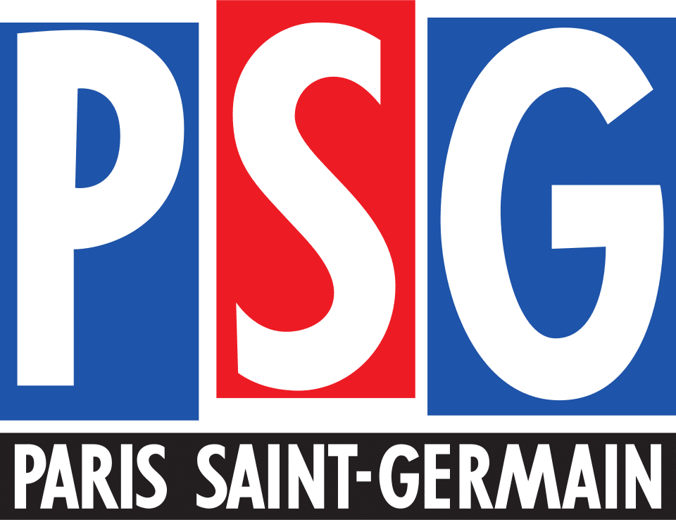
Under new owner Canal+, artistic director Étienne Robial redesigned the badge as three rectangles (two blue, one red) spelling 'PSG', with 'Paris Saint-Germain' in a band below, dropping the Eiffel Tower and cradle imagery entirely.
Why it changed: Canal+'s ownership from 1991 drove a corporate rebrand; the design proved unpopular with supporters.
Paris Saint-Germain F.C. logo 1996-2002
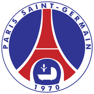
Following fan pressure, the traditional Eiffel Tower and cradle crest was restored, now adding the founding year '1970' at the base and updated bold sans-serif lettering.
Why it changed: Fan backlash against the 1992 Canal+ redesign led the club to reinstate the historic emblem.
Paris Saint-Germain F.C. logo 2002-2013
The crest kept the same core elements but used a darker shade of blue with refined spacing and lettering; a gold-ringed '40 ans' variant marked the 2010 fortieth-anniversary season.
Paris Saint-Germain F.C. logo 2013-2024
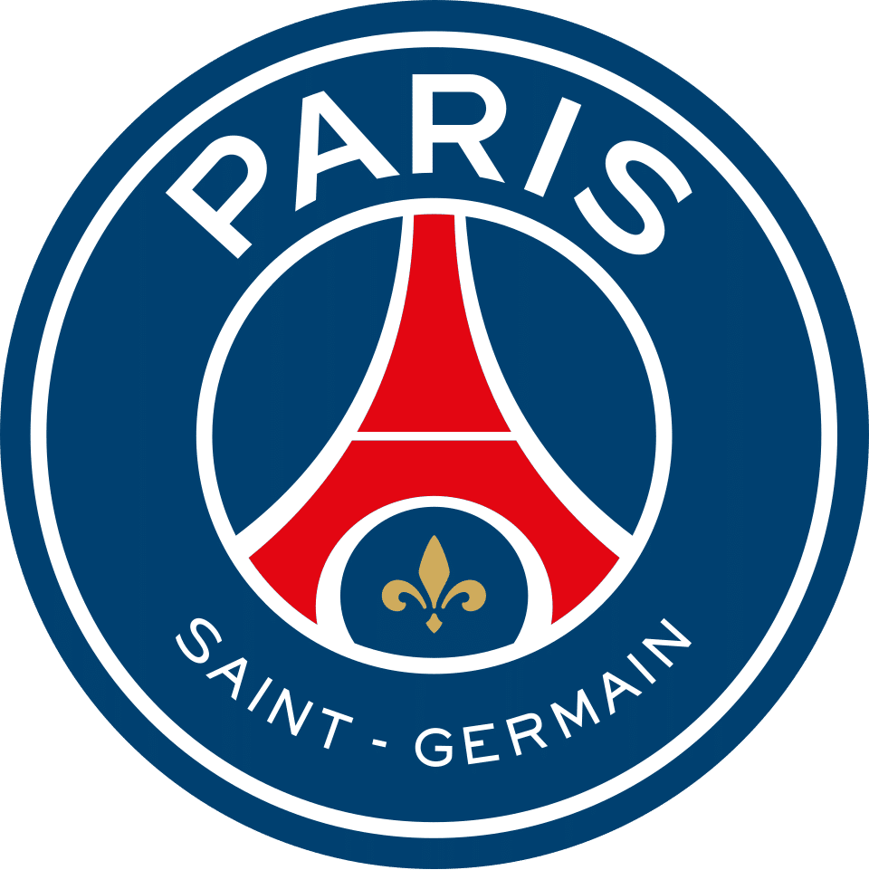
Under Qatar Sports Investments, the crest was redesigned to enlarge 'Paris' at the top over a smaller 'Saint-Germain' beneath, removed the royal cradle and the '1970' founding date, and enlarged/gilded the fleur-de-lis.
Why it changed: New Qatari ownership (from 2011) sought a simplified, more globally legible mark emphasising the 'Paris' identity.
Paris Saint-Germain F.C. logo 2024-present
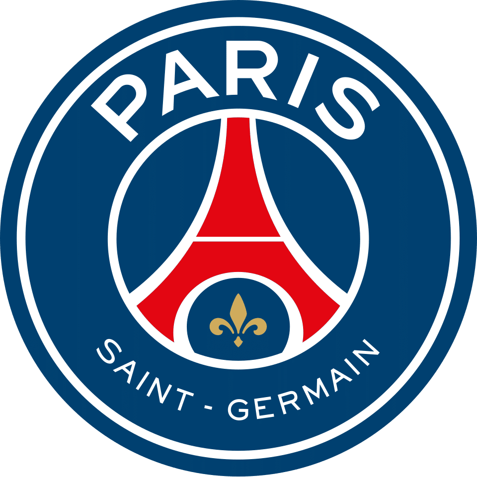
A further refresh kept the 'Paris'-led wordmark, Eiffel Tower and fleur-de-lis design; the club has since also used a lenticular version of the badge that shifts between shades of blue and red depending on viewing angle.
Paris Saint-Germain F.C. logo colors by era
| Era | Colors |
|---|---|
| 1970-1972 | Blue #297BC6Red #DF1E2BWhite #FFFFFF |
| 1972-1982 | Blue #202743Red #CC222BWhite #FFFFFF |
| 1982-1990 | Blue #202743Red #CD222BWhite #FFFFFF |
| 1990-1992 | Blue #202743Red #CC222BWhite #FFFFFF |
| 1992-1996 | Blue #1F54A9Red #ED1C24White/black text #FFFFFF |
| 1996-2002 | Blue #303594Red #C5252AWhite #FFFFFF |
| 2002-2013 | Darker blue #162C63Red #EC1C24White #FFFFFF |
| 2013-2024 | Blue #004170Red #E30613White #FFFFFF |
| 2024-present | Blue #004170Red #E30613White #FFFFFF |
Things worth knowing
- PSG's first crest (1970-1972) was shared with Paris FC, since both clubs stemmed from the same founding entity before splitting in 1972.
- The royal 'cradle' (berceau) of Saint-Germain-en-Laye, symbolising the birth of Louis XIV, featured on PSG's crest from 1972 and was removed in the 2013 redesign.
- The 1992-1996 Canal+-era crest replaced the Eiffel Tower entirely with a geometric 'PSG' lettermark; fan backlash led to the Eiffel Tower design being restored in 1996.
- The 2013 rebrand under Qatar Sports Investments enlarged 'Paris' over 'Saint-Germain' in the wordmark, and PSG has since also used a lenticular, angle-shifting-colour version of the badge.
Sources
- https://en.wikipedia.org/wiki/Paris_Saint-Germain_F.C.
- https://fr.wikipedia.org/wiki/Paris_Saint-Germain_Football_Club
- https://www.nss-sports.com/en/lifestyle/24492/logo-evolution-psg
- https://histoiredupsg.fr/lecusson-du-psg-evolution-du-logo-a-travers-notre-histoire/
- https://football-logos.cc/france/paris-saint-germain/logo-history/
- https://www.cfclassics.co/clubs/lists/crestevo/france/psg/psg-crest-evolution.htm
- https://commons.wikimedia.org/wiki/File:Logo_Paris_SG_1992.svg
- https://commons.wikimedia.org/wiki/Category:Paris_Saint-Germain_F.C.
- https://www.footmercato.net/a9149060289755021137-le-psg-devoile-son-nouveau-logo


