The team colors of Avto are red, white, and black.
Below are the Hex, RGB, Pantone, CMYK, and HSL codes for these colors.
Additionally, we provide both PNG and JPG files of the Avto logo and explore its meaning.
Inhaltsverzeichnis
Avto Color Palette
Avto Color Codes
Hex: #E50003
RGB: (229, 0, 3)
Pantone: PMS 186 C
CMYK: (0, 100, 99, 10)
HSL: (358, 100%, 45%)
Hex: #FFFFFF
RGB: (255, 255, 255)
Pantone: PMS White
CMYK: (0, 0, 0, 0)
HSL: (0, 0%, 100%)
Hex: #000000
RGB: (0, 0, 0)
Pantone: PMS Black
CMYK: (0, 0, 0, 100)
HSL: (0, 0%, 0%)
Hex:
RGB:
Pantone:
CMYK:
HSL:
Hex:
RGB:
Pantone:
CMYK:
HSL:
Hex:
RGB:
Pantone:
CMYK:
HSL:
Hex:
RGB:
Pantone:
CMYK:
HSL:
Hex:
RGB:
Pantone:
CMYK:
HSL:
Hex:
RGB:
Pantone:
CMYK:
HSL:
Avto Hex Color Codes
The Avto colors HEX codes are #FFFFFF for White, #000000 for Black, for , for , for , for , for , for , and #E50003 for Red.
Avto RGB Color Codes
The Avto colors RGB codes are (255, 255, 255) for White, (0, 0, 0) for Black, for , for , for , for , for , for , and (229, 0, 3) for Red.
Avto Pantone Color Codes
The Avto colors Pantone codes are PMS White for White, PMS Black for Black, for , for , for , for , for , for , and PMS 186 C for Red.
Avto CMYK Color Codes
The Avto colors Pantone codes are (0, 0, 0, 0) for White, (0, 0, 0, 100) for Black, for , for , for , for , for , for , and (0, 100, 99, 10) for Red.
Avto HSL Color Codes
The Avto colors Pantone codes are (0, 0%, 100%) for White, (0, 0%, 0%) for Black, for , for , for , for , for , for , and (358, 100%, 45%) for Red.
Avto Overview
- 📛 Nickname: Avto
- 📅 Year Founded: 2009
- 📍 Now Located In: Yekaterinburg, Russia
- 🏆 Greatest Success: Avto Yekaterinburg is known for being a feeder team to the KHL team Avtomobilist Yekaterinburg, contributing to the development of many young players who have gone on to have successful careers in the KHL
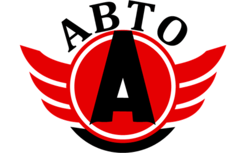
Avto Logo
Avto Logo PNG
Avto Logo JPG
Avto Logo Meaning
- .Winged “A” Symbol: The central element of the Avto Yekaterinburg logo is the bold, capital “A” with wings extending from its sides. This design symbolizes speed, agility, and progress, reflecting the team’s dynamic and forward-moving approach to the game. The wings suggest that the team is always on the move, striving to reach new heights in the MHL, and is ready to take flight in pursuit of excellence.
- Red and Black Color Scheme: The logo’s primary colors—red and black—carry deep symbolic meanings. Red represents energy, passion, and the intensity with which the team plays every match. It’s a color that exudes confidence and determination, characteristics that define Avto’s approach on the ice. Black, on the other hand, adds an element of power and authority, symbolizing the team’s strength and resilience in the face of challenges. Together, these colors create a striking contrast that makes the logo visually impactful and memorable.
- Circular Emblem: The circular shape around the “A” and wings signifies unity, continuity, and the team’s holistic approach to the game. The circle represents a sense of community and the unending support from fans and stakeholders, encapsulating the team’s inclusive spirit and their commitment to working together as one cohesive unit.
- Modern Typography: The clean, modern font used for the word “ABTO” (Avto) at the top of the logo reinforces the team’s contemporary and professional image. It reflects the organization’s forward-thinking attitude and their focus on innovation both on and off the ice.
- Symbol of Movement and Progress: The overall design of the Avto Yekaterinburg logo captures the essence of movement and progress, qualities that are central to the team’s identity. The wings, combined with the bold “A”, serve as a reminder of the team’s origins and their continuous journey towards success in the MHL.
Avto Logo Font
The font used in the Avto logo is a custom sans-serif typeface, designed specifically for the brand.
It’s chosen because it looks modern and streamlined, perfectly aligning with Avto’s image. The clear and bold letters make it easy to read and instantly recognizable.