

This page traces every crest Arsenal has worn, from the Woolwich cannons to the flat crest of today, with each era’s colors as one-click hex values.
The first badge borrowed three cannons from the arms of Woolwich, drawn from above so that they are still mistaken for chimneys.
The clean crest of 2002 was a legal decision as much as a design one, because the old badge could not be trademarked reliably.
For RGB, CMYK and Pantone, see the current Arsenal color codes.
Arsenal F.C. logo history timeline
Arsenal F.C. logo 1888-1922
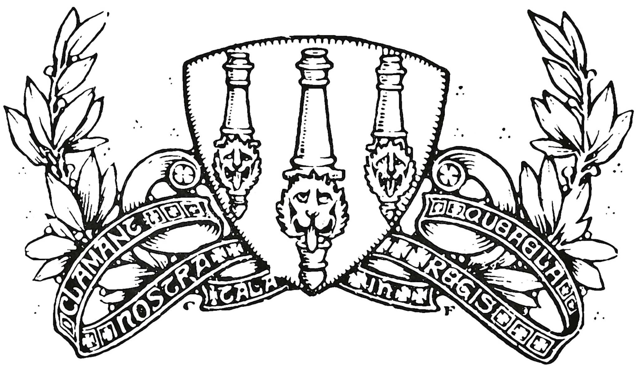
First crest of the Royal Arsenal era: three cannons viewed from above pointing northwards, mirroring the coat of arms of the Woolwich borough, each cannon carrying a carved lion's head and a cascabel to distinguish them from chimneys.
Arsenal F.C. logo 1922-1925
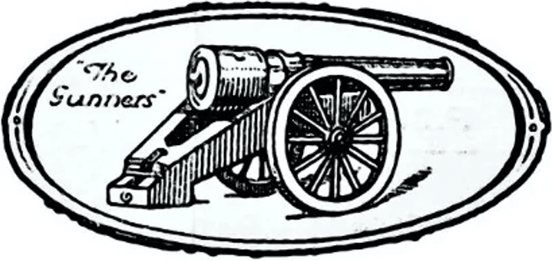
A single cannon returned after an absence of roughly 1913-1922, now pointing eastwards, with the club's nickname 'The Gunners' inscribed alongside it. Reduced from three cannons to one.
Why it changed: General simplification and design update following the club's move to Highbury; no single specific cause documented
Arsenal F.C. logo 1925-1930
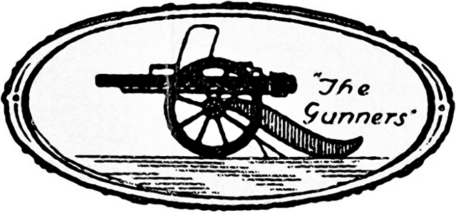
The cannon was reversed to point westward and its barrel slimmed down, retaining the 'The Gunners' lettering.
Arsenal F.C. logo 1930-1936
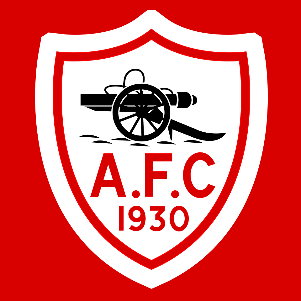
A white shield with red trim carrying a black cannon above the initials 'A.F.C' and the year '1930' in red. First time the mark was placed inside a shield rather than presented as a free-standing cannon.
Arsenal F.C. logo 1936-1949

Art Deco monogram badge of the Herbert Chapman era: red letters 'A' and 'C' framing a football in place of the letter 'F', the whole device set within a hexagonal red border. The cannon was dropped entirely.
Arsenal F.C. logo 1949-1994
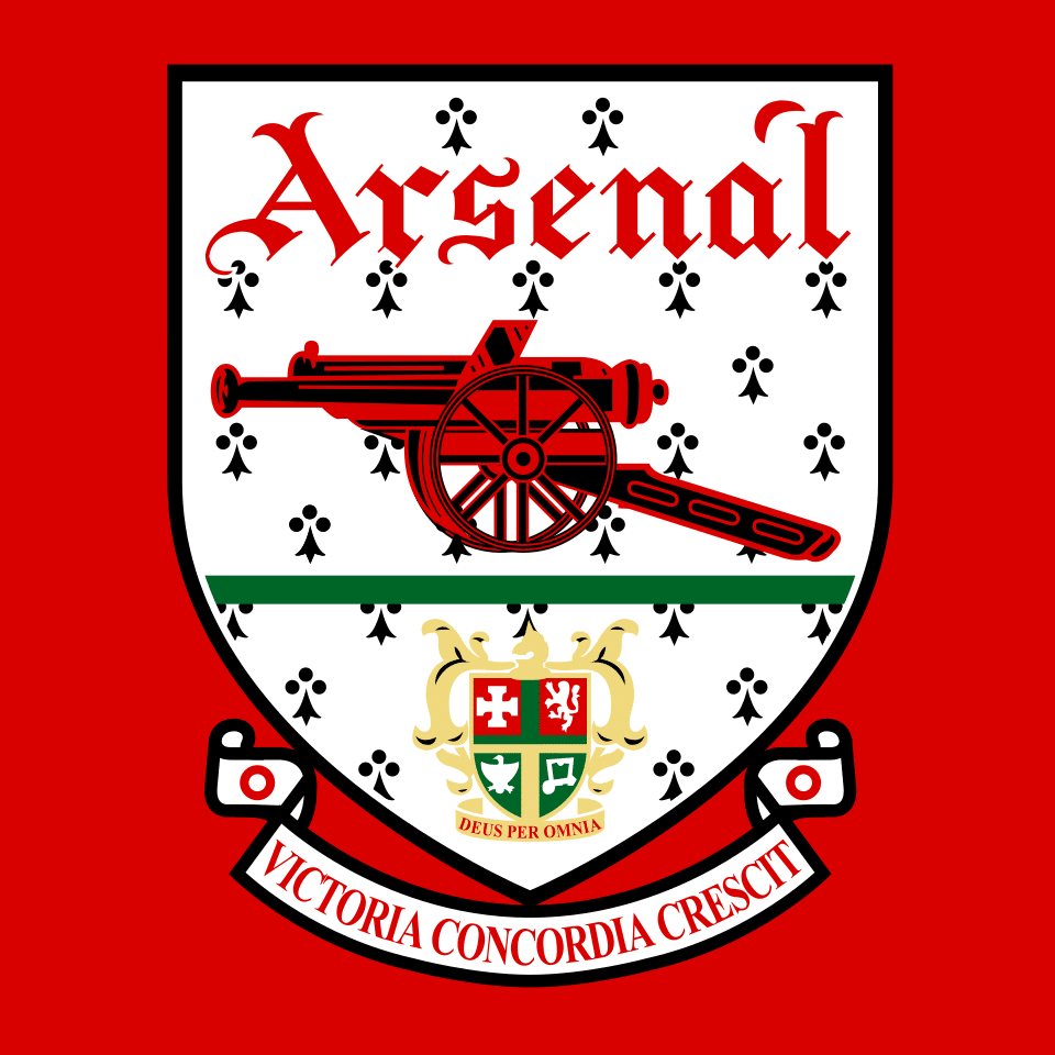
Redesigned crest bringing back an east-facing cannon below the club name in blackletter type, above the coat of arms of the Metropolitan Borough of Islington, with a scroll bearing the Latin motto 'Victoria Concordia Crescit' (Victory Through Harmony), coined by matchday programme editor Harry Homer.
Arsenal F.C. logo 1994-1996
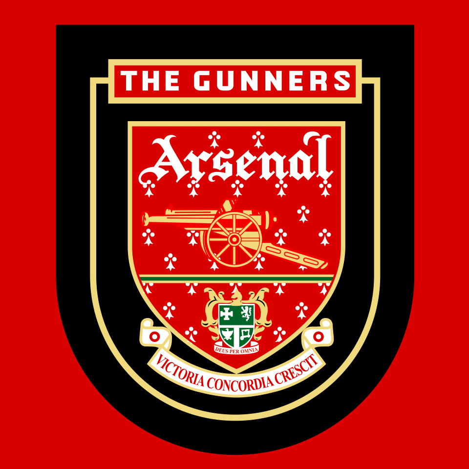
The 1949 crest recoloured for a mid-1990s branding refresh: black field with gold trim, white club-name lettering and a gold cannon. Structure unchanged, colours inverted from red to black and gold.
Arsenal F.C. logo 1996-2001
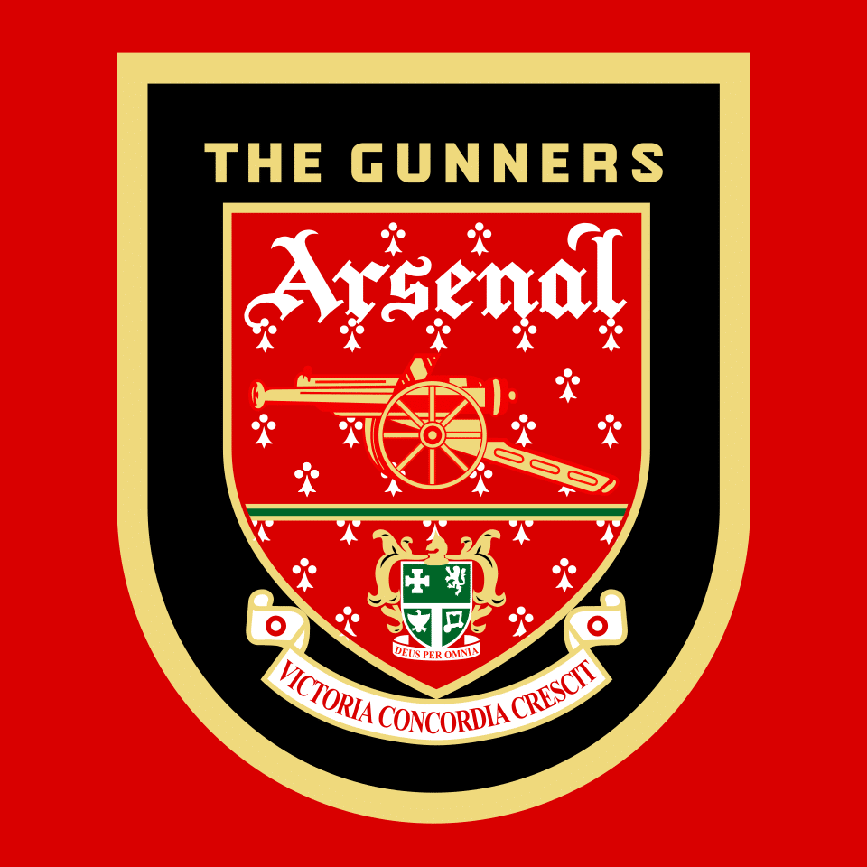
Continuation of the black-and-gold treatment with white lettering, a further minor refinement of the 1994 variant.
Arsenal F.C. logo 2001-2002
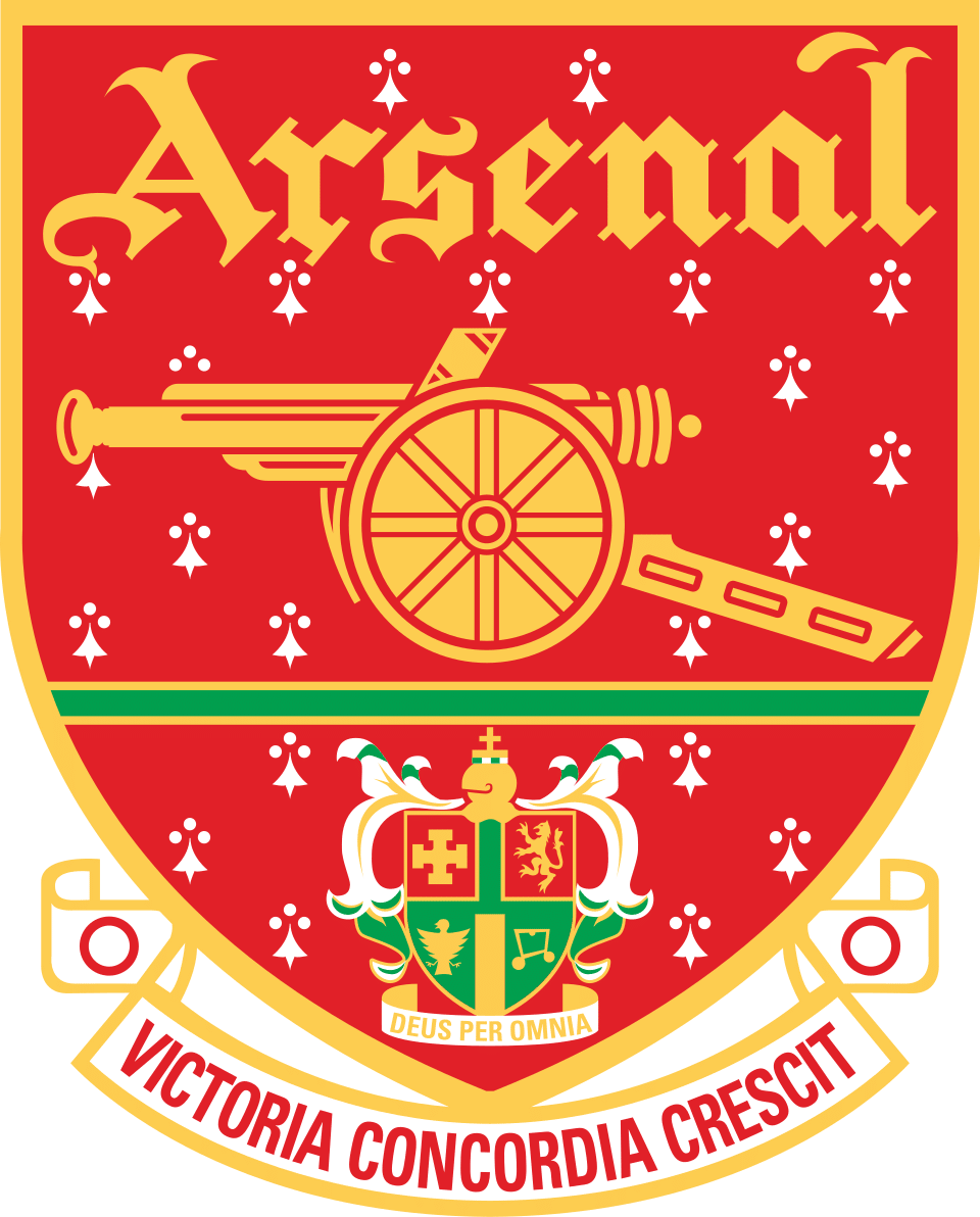
Transitional design shifting back to a red crest with gold trim and a gold cannon, used for one season immediately before the full 2002 overhaul.
Arsenal F.C. logo 2002-present
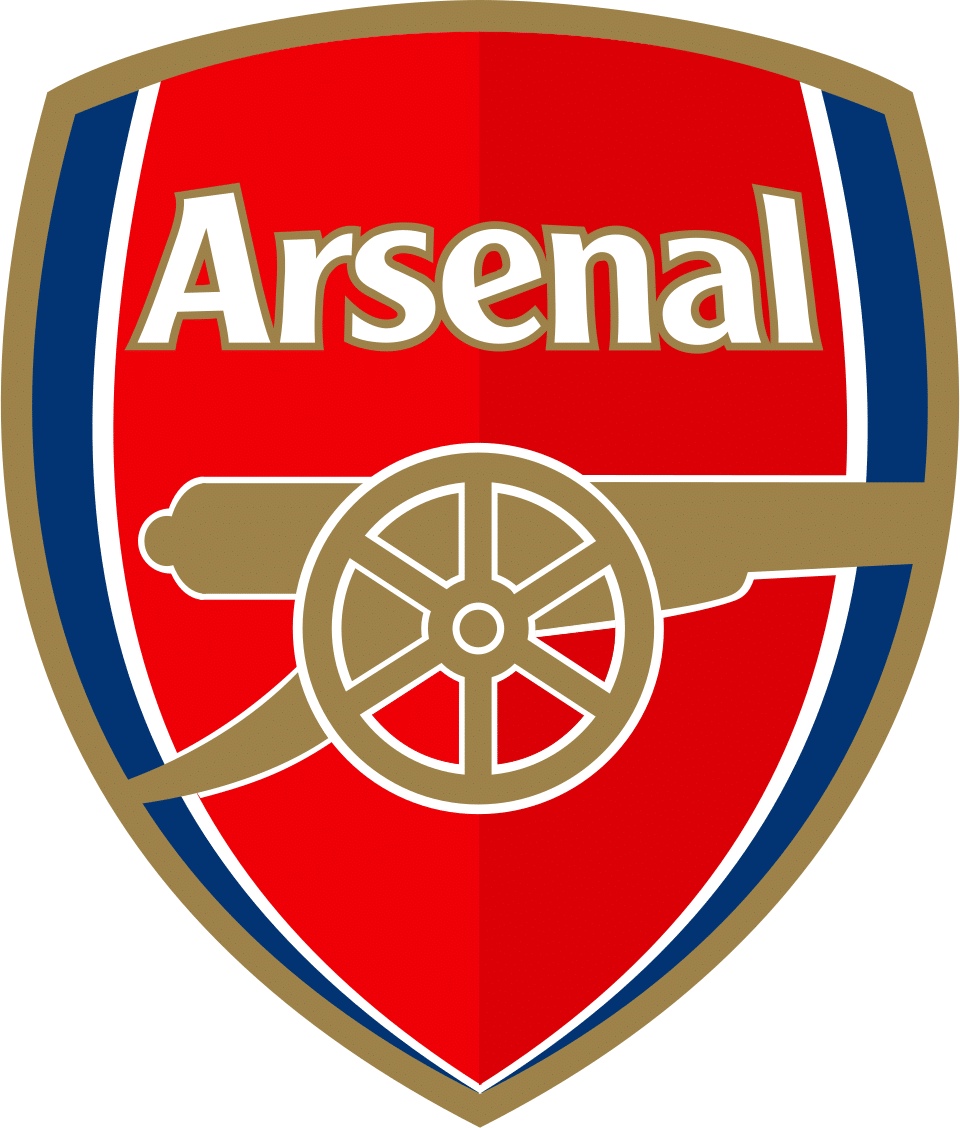
Multi-coloured shield with an east-facing cannon redrawn in modern, curved, simplified lines beneath a sans-serif 'Arsenal' wordmark; the green of the old Islington arms was replaced by dark blue. The Islington coat of arms, the blackletter type and the Latin motto were all removed.
Why it changed: Arsenal's own 2002 press release, preserved as the licensing rationale on the Wikimedia Commons pages for the old crest, states that the previous 1949 crest 'incorporates many separate elements, which have been introduced over a number of years' and that the club was therefore 'unable to copyright' it. The redesign produced a distinctive, fully protectable trademark. No source consulted supports the story that a Ghanaian brewery or any other unauthorized third party using an identical badge caused the change; that claim was not corroborated by Wikipedia, Wikimedia Commons or sportslogohistory.
Arsenal F.C. logo 2021-present (secondary mark)
No image of the cannon-only mark is publicly available. It is the cannon of the crest above, used on its own without the shield or the lettering.
A standalone cannon-only emblem was reintroduced on away kits from the 2021-22 season under Adidas, running alongside the 2002 shield rather than replacing it.
Why it changed: Heritage-driven kit design; first use of a cannon-only mark since 1991
Arsenal F.C. logo colors by era
| Era | Colors |
|---|---|
| 1888-1922 | Redcurrant #434343* |
| 1922-1925 | — |
| 1925-1930 | — |
| 1930-1936 | Red #D90000White #FFFFFF |
| 1936-1949 | Red #CE181E |
| 1949-1994 | Red #D90000 |
| 1994-1996 | Black #000000Gold #EDD77C |
| 1996-2001 | Black #000000Gold #EFD97D |
| 2001-2002 | Red #E12128Gold #FDCC50 |
| 2002-present | Red #DB0007Dark blue #0D1B5C |
| 2021-present (secondary mark) | — |
Things worth knowing
- The documented reason for the 2002 redesign was that the 1949 crest had accumulated too many separate elements over the years for Arsenal to copyright it; the widely repeated story about a Ghanaian brewery using an identical badge could not be verified in any source consulted.
- The cannon's facing direction changed repeatedly across the 20th century: north on the original three-cannon badge in 1888, east from 1922, west from 1925, and east again from 1949 onward including in the 2002 redesign.
- The Latin motto 'Victoria Concordia Crescit' was coined by matchday programme editor Harry Homer rather than by a club official or manager, and was dropped from the crest in 2002.
- Arsenal reintroduced a standalone cannon-only emblem on away kits from 2021-22, its first appearance since 1991.
- Arsenal's original kit colours were redcurrant/dark red rather than the modern bright red; the brighter 'pillar box red' with white sleeves was introduced by Herbert Chapman in 1933.
Values marked * were measured from the logo artwork of that period. Brand color standards did not exist for most of these eras, so no official hex value was ever published for them. Treat them as an accurate reading of the artwork rather than as an official brand value. Unmarked values are the club’s own published colors.
Sources
- https://en.wikipedia.org/wiki/Arsenal_F.C.
- https://en.wikipedia.org/w/index.php?title=Arsenal_F.C.&action=raw
- https://sportslogohistory.com/arsenal-fc-primary-logo/
- https://commons.wikimedia.org/wiki/Category:Arsenal_F.C._crests
- https://commons.wikimedia.org/wiki/Category:Logos_of_Arsenal_F.C.
- https://commons.wikimedia.org/wiki/File:Arsenal_F.C._crest_(1949%E2%80%932002).png
- https://commons.wikimedia.org/wiki/File:Arsenal_FC_logo_(2001-2002).svg
- https://commons.wikimedia.org/wiki/File:Arsenal_Crest_1996-2001.svg


