

This page traces every crest Manchester City has worn, from the city coat of arms to the round badge restored in 2016, with each era’s colors as one-click hex values.
For most of its history City had no crest of its own and used the arms of the city of Manchester, drawn differently by every printer.
The golden eagle shield of 1997 never won supporters over, so the club went back to a circle in 2016.
Today it runs on Sky Blue, navy/deep blue, red and white: #6CABDD #00285E #C6693B #FFFFFF. For RGB, CMYK and Pantone, see the current Manchester City color codes.
Manchester City F.C. logo history timeline
Manchester City F.C. logo 1880-1894
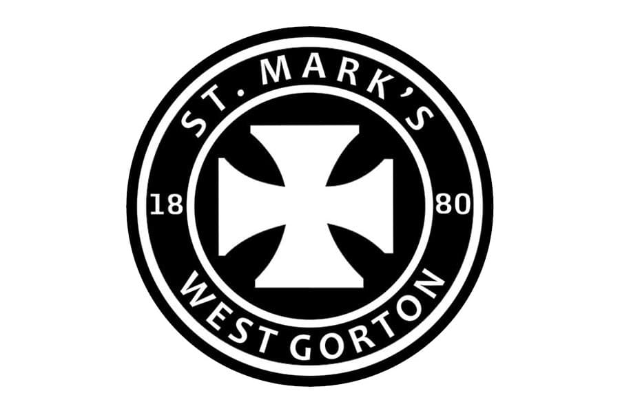
As St Mark's (West Gorton), the club used a circular monochrome badge with a white cross pattee on a black background, with the club name and 1880 founding date in white text around the circle.
Why it changed: The club renamed itself Manchester City in 1894, replacing the St Mark's identity.
Manchester City F.C. logo 1894-1960s
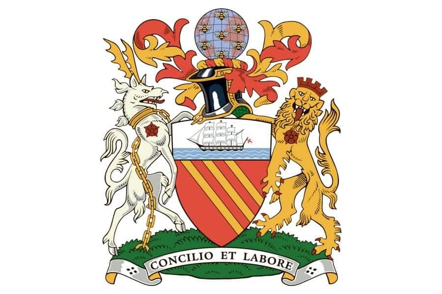
A heraldic shield derived from the City of Manchester's coat of arms: a gold/orange shield with a clipper ship on blue waves in the upper half and three diagonal bendlets in the lower half, flanked by lion and antelope-type supporters, under the motto 'Concilio et Labore' (By Wisdom and Effort).
Manchester City F.C. logo c.1960-1972
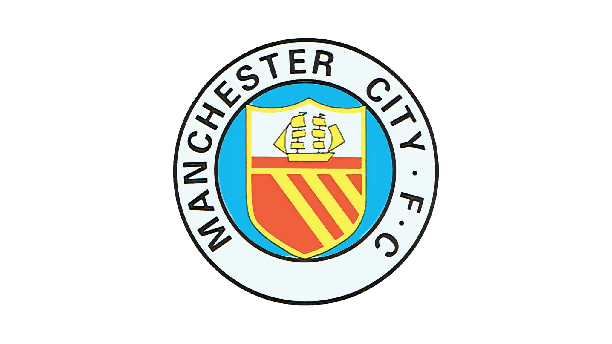
A simplified version dropped the heraldic animal supporters, showing a plain shield with a yellow/gold clipper ship on wavy lines set in a navy-blue frame.
Why it changed: Modernisation of the older, ornate heraldic design into a simpler badge suitable for shirts and print.
Manchester City F.C. logo 1972-1976
The three diagonal stripes in the lower half of the shield were replaced with the red rose of Lancashire on a white background, while the ship remained in the upper half.
Why it changed: Introduction of the red rose of Lancashire as a regional symbol alongside the ship.
Manchester City F.C. logo 1976-1997
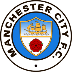
The College of Arms formally granted a heraldic badge blazoned as a roundel per fess azure and argent, with a three-masted ship under sail in chief and a red rose (gules, barbed and seeded) in base; this circular design with 'M.C.F.C.' lettering was used, with minor tweaks, into the 1990s.
Why it changed: Formalisation of the club's badge via an official grant of arms from the College of Arms.
Manchester City F.C. logo 1997-2016
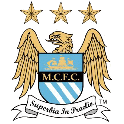
A redesigned crest placed the shield (ship in chief, three diagonal stripes in base) in front of a golden eagle with its head turned left, topped by three stars, with the Latin motto 'Superbia in Proelio' (Pride in Battle); the red rose was dropped.
Why it changed: Club-stated intent to convey 'grandeur and superiority' for a new era; the design proved controversial and drew fan protests.
Manchester City F.C. logo 2016-present
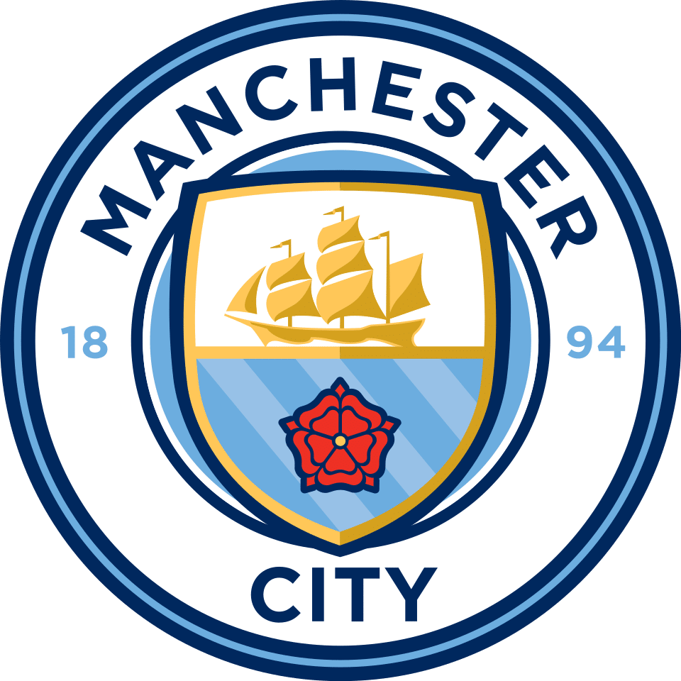
Following a fan consultation and vote, the club adopted a circular badge on 26 December 2015 (used from the 2016-17 season), restoring the ship and red rose within a shield inside a roundel, with 'MANCHESTER CITY' arched at the top and the 1894 founding year, in dark blue and sky blue with red and white accents.
Why it changed: Fans were consulted and voted on colours/shape, preferring a return to a traditional circular look over the eagle-and-shield design.
Manchester City F.C. logo colors by era
| Era | Colors |
|---|---|
| 1880-1894 | Black #000000White #FFFFFF |
| 1894-1960s | Orange/gold #EFB73F |
| c.1960-1972 | Yellow/gold #F8F252Navy blue #14B8EDWhite #FFFFFF |
| 1972-1976 | Red #BA4132White #FFFFFF |
| 1976-1997 | Blue #167BE0White #FFFFFFRed #BF0000 |
| 1997-2016 | Gold #F2CA71Blue #64B5DCWhite #FFFFFF |
| 2016-present | Sky Blue #6CABDDNavy/deep blue #00285ERed #C6693B*White #FFFFFF |
Things worth knowing
- The 1997 eagle-and-shield crest, intended to signal a bold new era, was unpopular with many supporters and coincided with the club's slide to the third tier of English football.
- The 2016 badge followed a formal fan consultation; club-reported survey results cited in coverage indicated majorities favoured a blue design with white detailing.
- The red rose of Lancashire, first added in 1972, was dropped during the 1997-2016 eagle era and restored in the 2016 redesign.
- Manchester City's current sky blue brand colour is documented as hex #6CABDD across multiple team-colour reference sites.
Values marked * were measured from the logo artwork of that period. Brand color standards did not exist for most of these eras, so no official hex value was ever published for them. Treat them as an accurate reading of the artwork rather than as an official brand value. Unmarked values are the club’s own published colors.
Sources
- https://sportslogohistory.com/history-and-evolution-of-manchester-city-logo/
- https://sportslogohistory.com/manchester-city-fc-primary-logo/
- https://sportslogohistory.com/manchester_city_fc_1997-2016/
- https://sportslogohistory.com/manchester_city_fc_1926-2011/
- https://sportslogohistory.com/manchester_city_fc_1960-1970/
- https://en.wikipedia.org/wiki/Manchester_City_F.C.
- https://en.wikipedia.org/wiki/History_of_Manchester_City_F.C.
- https://en.wikinews.org/wiki/File:Manchester_City_FC_badge.svg
- https://commons.wikimedia.org/wiki/Category:Manchester_City_FC
- https://www.schemecolor.com/manchester-city-f-c-logo-colors.php
- https://teamcolorcodes.com/manchester-city-fc-colors/


